The brief
Chefe do Ano is a national culinary competition. The identity had to carry culinary prestige with a contemporary, energetic tone, and stay recognisable across print, digital and motion.
What was made
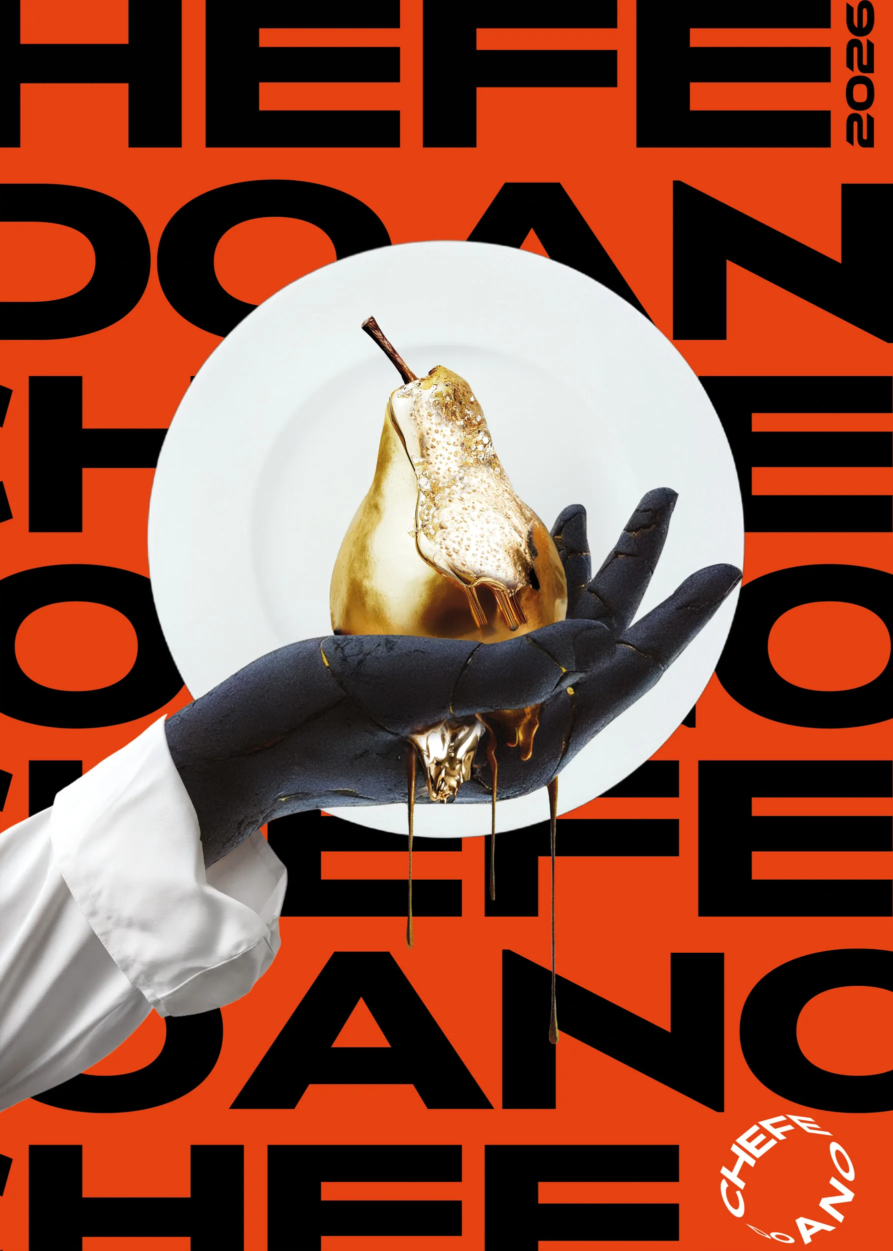
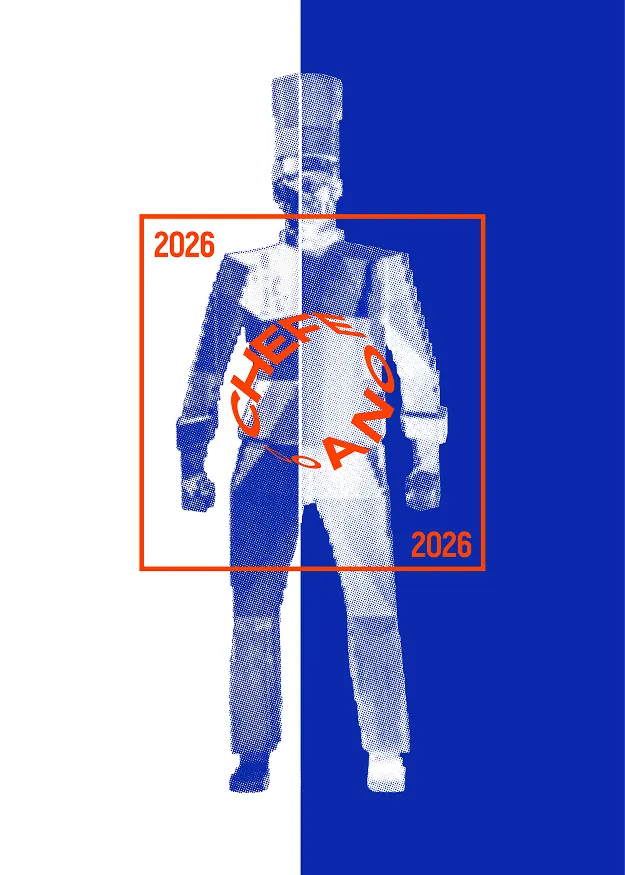
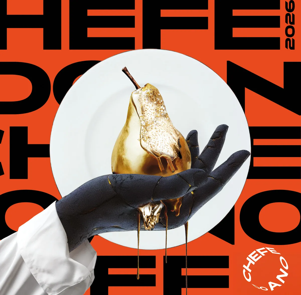
A type-led system on a modular layout: the name repeated and cropped across an orange field, a gilded pear as the hero object, a circular seal and the year set vertically. Three concept directions were presented, the client chose one, and the whole system was built from it. It is the same process every BALANCE project follows.
Delivered
- Key visual and three concept directions
- Typography, palette and graphic language
- Composition and image guidelines
- A five-second motion piece
- Poster, social and story formats, signage and a 10-metre banner
- Print-ready files

Your brand
next.
A two-minute brief. Then book a free intro call or continue by email.